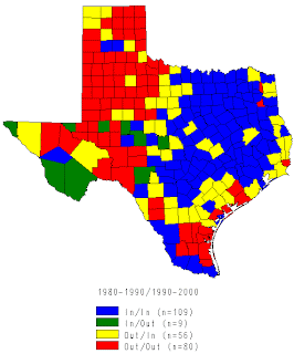
This map shows the net migration change in the counties of Texas in the years 1980 – 1990 and 1990 – 2000. Legend is the only present element in this map. The definitions in the legend are also not clear and are hard to understand. Mapreaders will have a hard time determining what the mapmaker is trying to point out.
The divisions on the maps were also not clear, there should be labels on the names of the county since this map shows migration patterns. So for me, this map is not a very good thematic map because maps should be understood and also, maps are only as good as the information it passes to the people and this somehow failed to deliver the information to me well.

No comments:
Post a Comment